Project
002
Medicare.gov
Redesigning the legacy Medicare app's plan search and enrollment experience.
Imagine you or your elderly parent shopping for a health care plan at the time in life when it is most needed. It's no secret that navigating the world of Medicare is no easy process. Costs of co-pays, medications, and premiums with possibly living on a very tight budget are real concerns for a lot of Americans.
Info
Role
UX Designer as part of a small delivery team
Timeline
1 year
Tools
Sketch
Invision
Mural
Overview
Problem
How can we make this crucial public service easy to understand and access the info they need to make an informed decision and reduce the burden placed on people as they make this important life decision?
Outcome
We redesigned and rebuilt the Medicare legacy app and increased enrollment by 40%.
Starting with research
Up until this point, Medicare.gov’s research effort was mainly focused on marketing validation and product comparison, rather than an investigation into the pain points and need of users. Our team pushed the Research department to adopt new methods and explore different strategies to gain insights on user's needs.
From user surveys, usability testing, customer service representatives, and state-sponsored support agencies our team was awash with data into how people used, signed up for, and accessed their Medicare services. Through these usability sessions we identified key pain points that would provide the highest impact to users.
In our research we most commonly heard:
"There's too much info being thrown at me at once ..."
"It's too complicated. I don't even try and do it. I just call them."
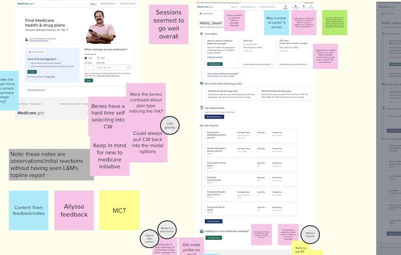
Workshops and discovery
A screen shot from a workshop with client stakeholders to review user testing and collect their feedback and ideas.

The full picture
This is a small piece of a service design map I created to help our team and stakeholders have a full picture of the user's experience on, and off, the site.
The Work
For an MVP delivery our key question was of course, how can we deliver the most impact to users in the shortest amount of time? Afterwards my team and I would continue to reassess user pain points and business objectives to ensure we were improving.
Collaborating with our stakeholders we aligned on our initial key priorities:
- Reduce cognitive load and present data to the user only as they need it while adding their medications and viewing drug costs.
- Allow users to filter results which leads to increased engagement and success.
- Build the application to be responsive with all sizes of devices and types of users in mind
- Prioritize accessibility, performance, and security.
Priority One
Simplify and reduce cognitive load
A key pain point from users was the drug and pharmacy experience within the app so one of the first priorities was reduce cognitive load and present information to the user only when they need it.
After several mockup and coded prototype iterations we did exhaustive user testing to validate whether our solutions tracked with user expectations and needs, iterating where needed.
A simple stepped process to add medications
This was a new feature that we added. Keeping this process as easy as possible was paramount.

Above shows early-stage wireframes and notes considering the needed features and solutions to user pain points. Key points noted in the image are:
- Provide the user with the ability to add and edit a drug selection.
- The drug card needed to be flexible in its layout because of data variations within the API.
- How much clarifying text should be added, in addition to input fields, to help users with the interacion?
Below shows the final MVP screens for this pattern to add drugs, at the time of the MVP launch.


A pharmacy search
This new feature improved health plan cost accuracy for users by providing real-time costs.

Present data clearly
From research, it was clear that drug costs are one of the most stressful and most important decision points for a beneficiary. There is an enormous amount of data presented to the user on the product (plan) details screen. We provided simple tables with clear explanations, iconography, and callouts.
Priority Two
Filtering pattern
In user research we found that users were overwhelmed with the number of results and wanted a way to pare down to a more personalized result list.

Priority Three
Responsive and mobile-first
User research told us that even though this is an older demographic, a significant percentage of users relied on phone and tablet devices.

Priority Four
Prioritize site accessibility and usability
Up to this point medicare.gov had been concerned only with 508 compliance rather than providing truly inclusive user experiences. Within this work we performed testing with users with screen reader users as well as executing manual and automated a11y testing.
Our main areas of focus were users with no vision, low vision, cognitive issues, and reduced mobility of their hands. In the end this gave us a 100% score on our accessibility testing by the Section 508 Office at the Center for Medicare Services.
The Outcome
Further iterations based on usability testing and collaborations with client stakeholders allowed the work to evolve, as it should, but this work allowed for a solid foundation to serve to the American people.
Since CMS launched the redesigned Medicare Plan Finder, the app:- Has helped more than 2.6 million Medicare beneficiaries enroll in a Medicare plan, about 40% more enrollments than the legacy tool the previous year
- Saw an average of 373,000 visitors a day during the next Medicare Open Enrollment.
Most importantly, we were getting positive feedback from our users:
Even I — a 73-year-old guy who’s not very computer savvy — can figure it out.
I really like it because it’s self-explanatory and gives things in detail. You know up front what each plan costs a month, what your deductibles are, and what drugs are covered and what drugs aren’t. That’s really important.