Providing a path forward for the former incarcerated
My role
- UX/UI Design
The Challenge
Reducing recidivism is a complex and varied problem. Without a community support system, achieving that goal of staying free is much more daunting.
(Company name redacted) was tasked to build a web app that would allow inmates to search and sign up for community services — providing a conduit between the inmates and services within the community such as education, food banks, social workers, etc. In addition to this, the prison staff and case workers need to have oversight of where those who are incarcerated may be at a certain time and which of these community offerings they are involved in.
For eample, if an inmate is admitted to, and permission to attend, a community class on financial literacy the staff needs a digital record of what time the person leaves, returns, and who with.
Our core features of focus
- Clear and accessible community service searches for inmates. People who are incarcerated need the ability to research opportunities and resources in the community. They also need to be able to share the info of these resources with a family member outside of the facility, providing a stronger connection for families allows for increased chances of success.
- System oversight for multiple layers of staff. Facility staff required oversight of the activities (offsite visits and communications) at all times so providing various levels of admin privilege and system access to the wardens, officers, and case workers was crucial.
- Access and communication. The community organizations that provide services, case workers for the incarcerated, and the inmates each have a variety of use cases and entry points to the system.
The Work
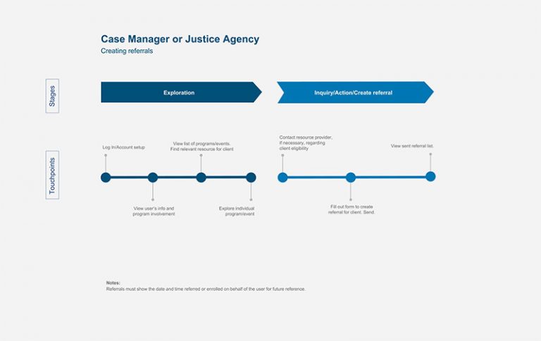
Our, small cross-functional team collaborated with the client plus former inmates to better understand the needs and requirements. This began with simply listening.
- Hours of conversations with inmates and staff to understand their experiences and requirements.
- Mapping of needs and experience through user flows how those users related to each other.
- Identifying data constraints and technical requirements such as internet/wifi access within the prison system and how those things played into how our data appeared at different times to the users.
- Mockups, prototypes, and iteration
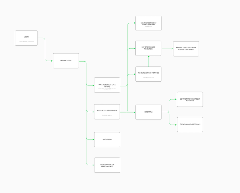
An early draft of a user flow to help think through how people who are incarcerated may use the tool. Note that there were several user types to be accounted for and shown here is just one.
An early mapping of one level of admin's purpose and action within the tool. This was done to provide visuals to discuss from and work through after early discussions with stakeholders.
Component-based Design
A key focus of the UI design was to use modular and responsive components and patterns to create cohesive, consistent experiences. This would also have the benefit of speeding up our team’s workflow and delivery.
Using Figma we created a system to help us think of our user interface elements as both a cohesive whole and a collection of parts at the same time. Within this is the importance of accounting for the dynamic nature of content.
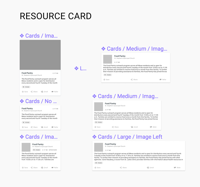
Components in Figma for our consistent and modular experience.
You can create good experiences without knowing the content. What you can’t do is create good experiences without knowing your content structure. What is your content made from, not what your content is. — Mark Boulton
Accessibility
Another critical point was the need for the design to be accessible, flexible, and performant. Many who are incarcerated would be accessing the app on devices with less than optimal operating systems and internet access. So the app must accomodate for the constraints that these phones and tablets provided. Our team worked with our engineers to focus on building within this constraint but also our designs needed to be lightweight and flexible — considering when resources may not load optimally.
Lastly, a significant percentage of people who are incarcerated have learning disabilities, cognitive limitations, or have limited use of vision or motor skills. Given this, the app needed was built prioritizing inclusive experiences. This is exemplified in patterns such as: include a label with icons, proper form design, plain language, etc.
The Outcome
While I can't show the final app for NDA reasons, below are early prototypes I designed during our ideation phase.
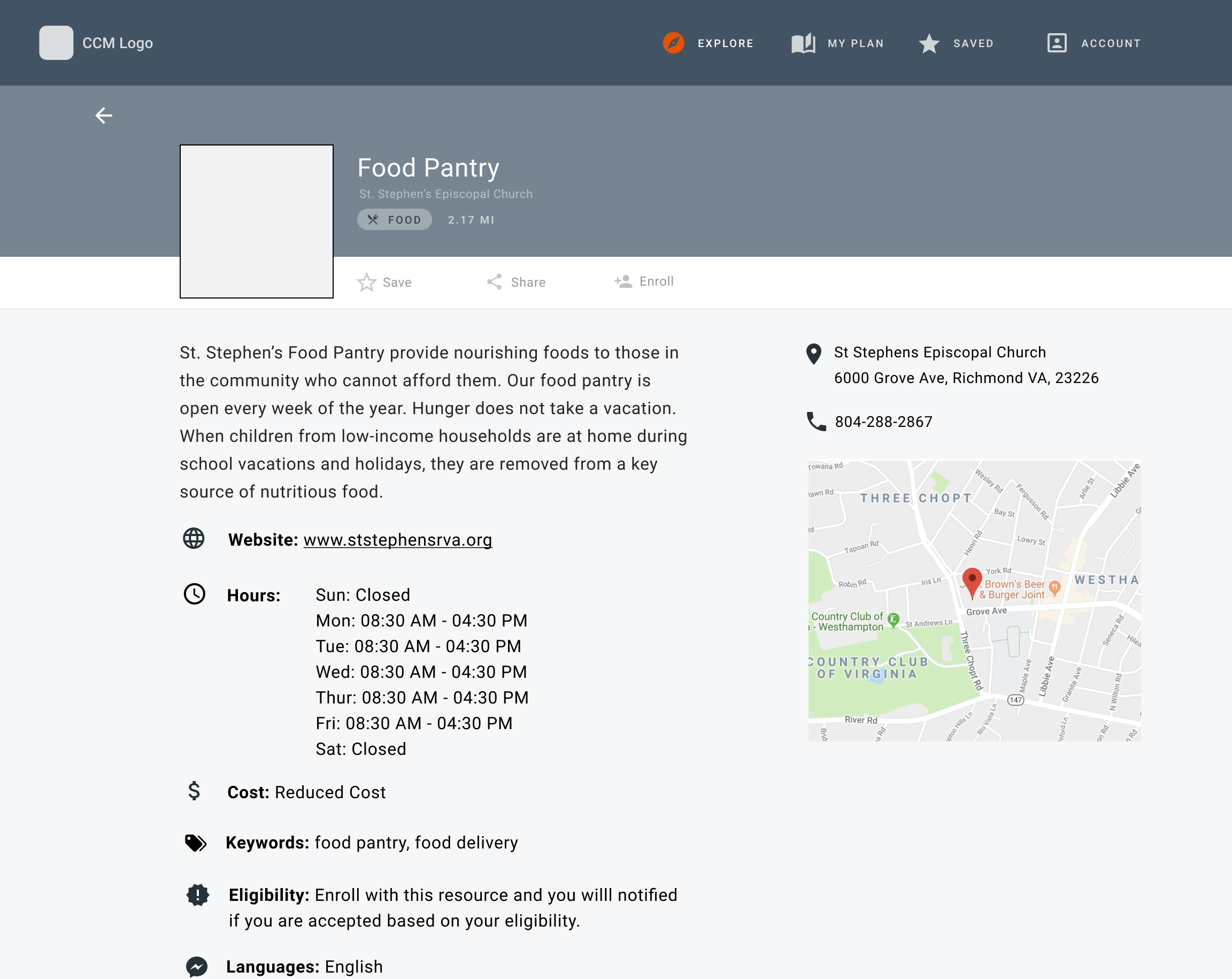
An early mockup, on desktop, showing program offerings for someone who is incarcerated.
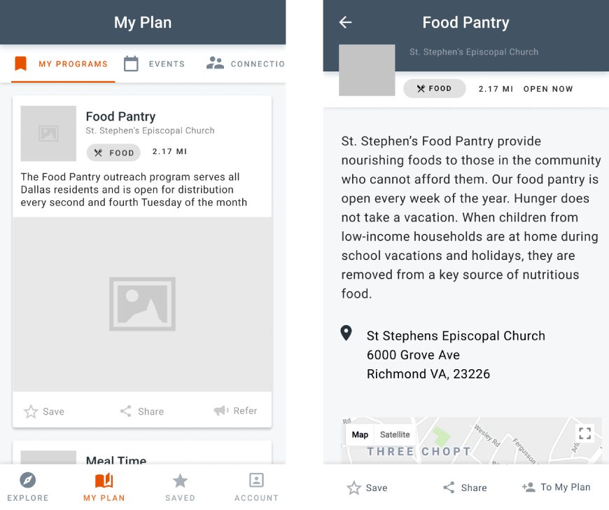
An early mobile mockup showing program offerings (on the left) for someone who is incarcerated and a community program's listing (on the right).
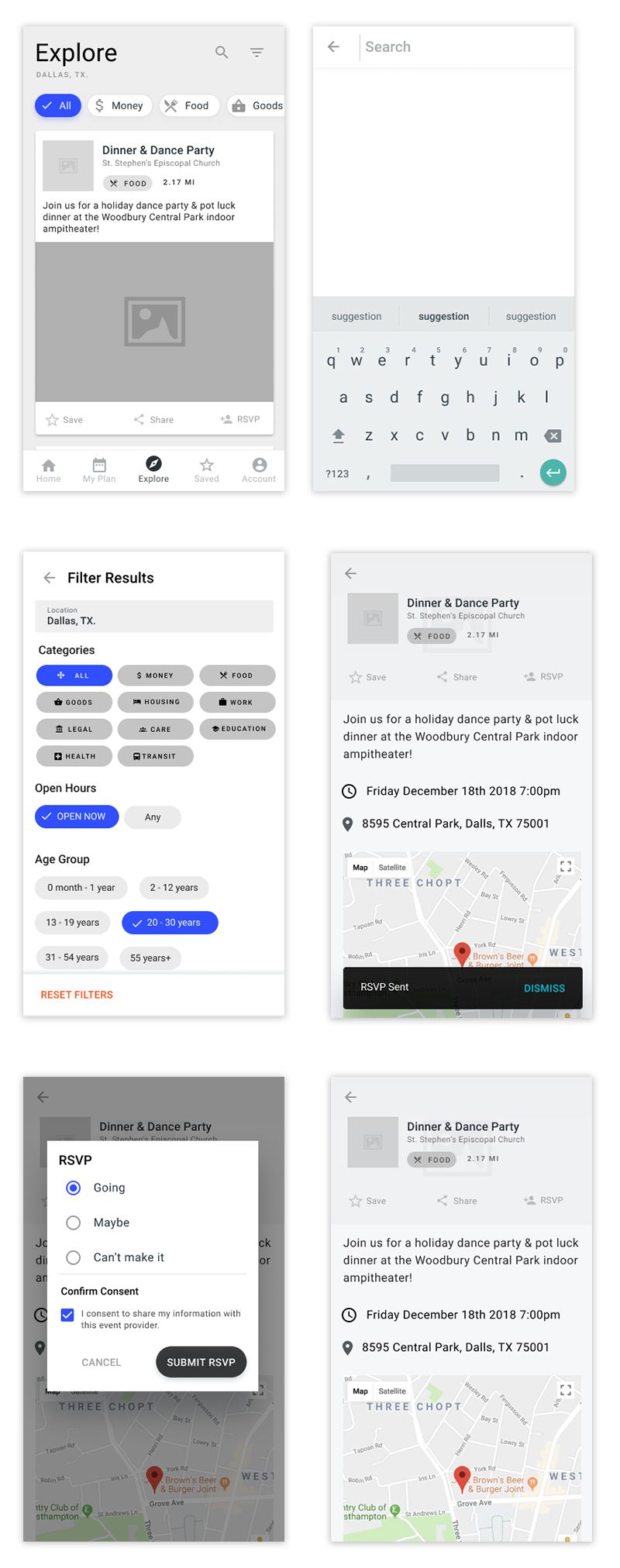
Various states of a user looking for, filtering, and signing up for a program.
By providing an open access to community offerings, we were able to allow the incarcerated and formerly incarcerated the highest chances of success.