Project
03
Scaling Inclusive Design: The Native Mobile Accessibility Toolkit
Scaling inclusivity by architecting the first native-mobile annotation system for T-Mobile’s enterprise design system.
Info
Role
Senior Accessibility Design Lead
Tools
Figma
Overview
Problem
With over 100 designers working across dozens of product squads, accessibility handoff at T-Mobile was inconsistent. Designers lacked a standardized way to communicate complex mobile-specific traits (like accessibility labels, grouping, etc.) to iOS and Android engineers. This led to "guesswork" during development, high remediation costs, and a reactive "audit-and-fix" cycle.
Outcome
I led the creation of a Native Mobile Accessibility Annotation Kit to move accessibility from a final audit to a foundational design requirement. By standardizing the handoff logic for SwiftUI and Jetpack Compose, we provided a unified source of truth that is currently being ingested into the Core Enterprise Design System.
Research-Led Architecture
We didn't build in a vacuum. I led a small task force to conduct user research with both UX designers and engineers. We mapped out the "friction points" for both roles in the current handoff process. I identified that engineers were often not given enough accessibility information within the Figma mockups.
Designers did have access to a web-specific accessibility annotation kit but not for a native-specific kit. This meant that they would use the web annotation kit but they must spend extra time reconfiguring the annotation components to be applicable to native screens. Designers felt they didn't have enough time to do annotations due to the existing annotation's kit setup and they wished for more "built-in" documentation within the annotation kit.
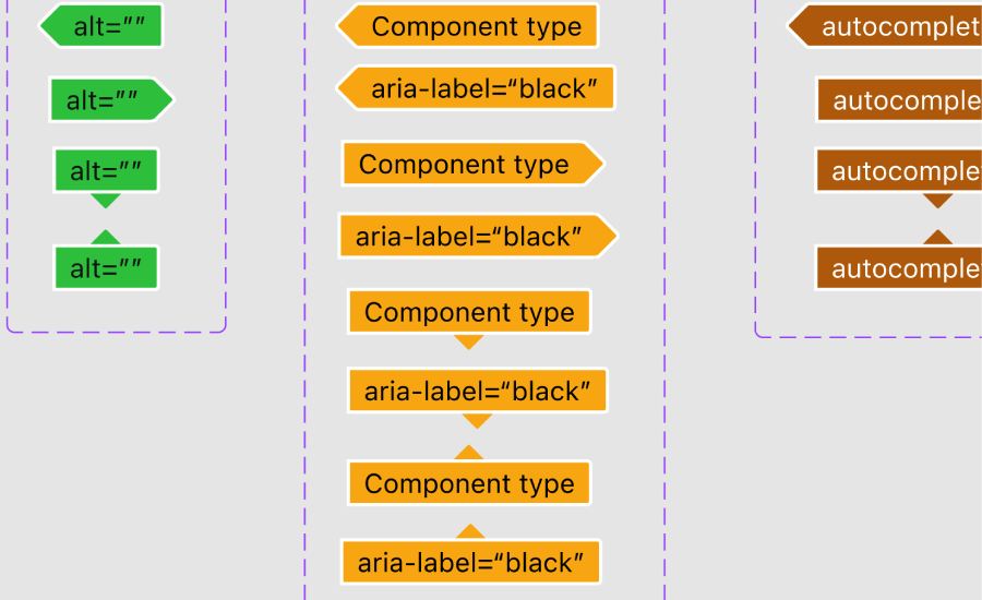
Robust Documentation
Instead of vague notes, the kit uses a modular system of "stickers" and "callouts" that inherently contain:
- Links to our existing accessibility documentation
- Preset accessibility traits and fields
- Reduced footprint while providing ample information for engineers
Systems Integration & Handoff
The goal was adoption. To ensure the kit was used, we worked directly with the Design System team to ensure the kit was ingested into the core library. This meant that accessibility wasn't a "separate file" designers had to find—it was a native part of their existing Figma workflow.
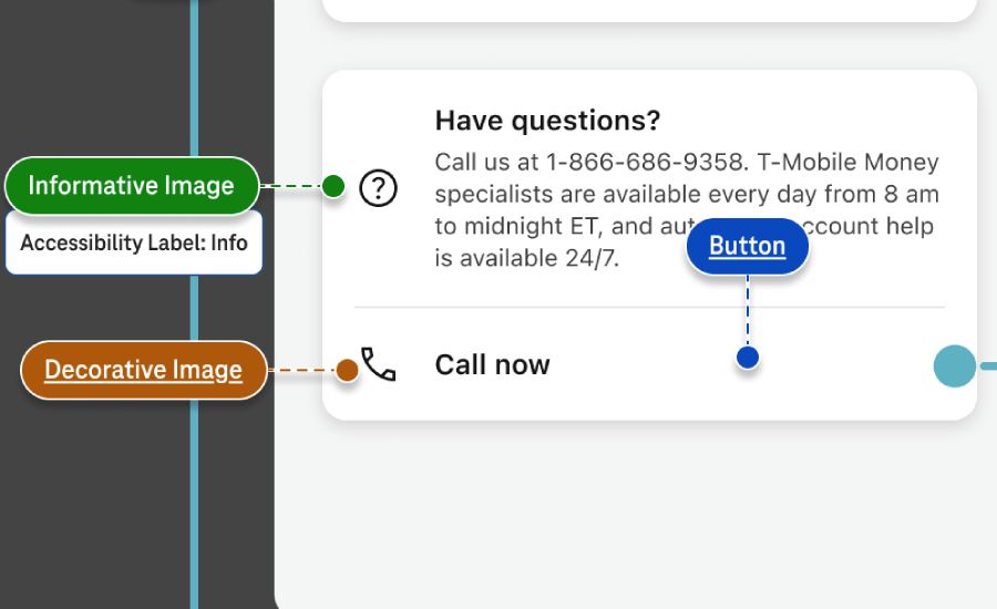
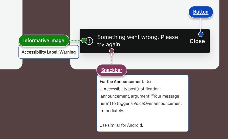
Below are screenshots showing the new accessibility annotation pieces being used on native screen mockups at design handoff.
Outcome and impact
The implementation of this annotation system and interaction logic transformed our delivery process from a "wait and see" audit model to a proactive, inclusive design culture.
- Scalability: Transitioned from a "manual audit" culture to an "automated guidance" culture for 100+ designers.
- Efficiency: Reduced the communication overhead between design and engineering, ensuring that accessibility requirements are clear before the first line of code is written.
- Enterprise Standard: The kit now serves as the technical blueprint for all native mobile products within the T-Mobile ecosystem.