Project
04
Architecting an Accessible Design System
Providing modular, accessible, and scalable components for enterprise EdTech.
The company name and many details have been redacted for NDA. Included below are mockups with identifiers removed. Feel free to ask me about details of this work.
Info
Role
UX Designer and UI Developer on a small design system team
Timeline
6 months
Tools
Sketch
HTML/CSS/Handlebars.js
Overview
Problem
Scaling Quality and Speed In a complex enterprise environment, delivering consistent user experiences is a constant struggle. We faced two primary challenges:
- Inefficiency: Designers and engineers were "reinventing the wheel" for every feature, leading to wasted effort and slow delivery.
- Fragmentation: A lack of standardized components resulted in a disjointed user experience and inconsistent accessibility compliance across the platform.
Outcome
I co-architected a modular, 508-compliant component library that reduced "time to delivery" by more than 25%, while ensuring that accessible patterns were "baked into" the code from day one.
The work
When I joined the project, the MVP requirements were set, but the execution required a bridge between design intent and production-ready code. My role as a UX Designer and UI Developer was to:
- Modernize & Responsive Design: Redesign legacy components to meet modern visual standards while ensuring fluid responsiveness across all screen sizes.
- Coded Implementation: Built the library using HTML, SCSS, and Handlebars.js, ensuring the code was as modular as the design.
- Accessibility-First Documentation: Authored the documentation for components and patterns, defining the "unseen" experience (ARIA roles, focus management, and screen reader behavior).
- Validation & Compliance: Rigorously tested every component for 508 compliance using VoiceOver, TalkBack, Axe, and keyboard-only navigation.
- Strategic Handoff: Partnered with software engineers to integrate the library into the enterprise system, ensuring a seamless transition from library to live product.
The "Design-to-Code" Bridge
When I joined the project, the MVP requirements were set, but the execution required a bridge between design intent and production-ready code. My role as a UX Designer and UI Developer was to:
- Modernize & Responsive Design: Redesign legacy components to meet modern visual standards while ensuring fluid responsiveness across all screen sizes.
- Coded Implementation: Built the library using HTML, SCSS, and Handlebars.js, ensuring the code was as modular as the design.
- Accessibility-First Documentation: Authored the documentation for components and patterns, defining the "unseen" experience (ARIA roles, focus management, and screen reader behavior).
- Validation & Compliance: Rigorously tested every component for 508 compliance using VoiceOver, TalkBack, Axe, and keyboard-only navigation.
- Strategic Handoff: Partnered with software engineers to integrate the library into the enterprise system, ensuring a seamless transition from library to live product.
Final Outcome: Measurable Impact
The launch of this system transformed our delivery pipeline:
- 25% Efficiency Gain: It is estimated that teams shipped code 25% faster by utilizing the pre-built, pre-tested library.
- Consistent UX: Eliminated the "UI drift" across the enterprise, providing students and administrators with a predictable, reliable interface.
- Compliance at Scale: Because the components were pre-vetted for 508 compliance, we significantly reduced the volume of accessibility bugs found during QA.

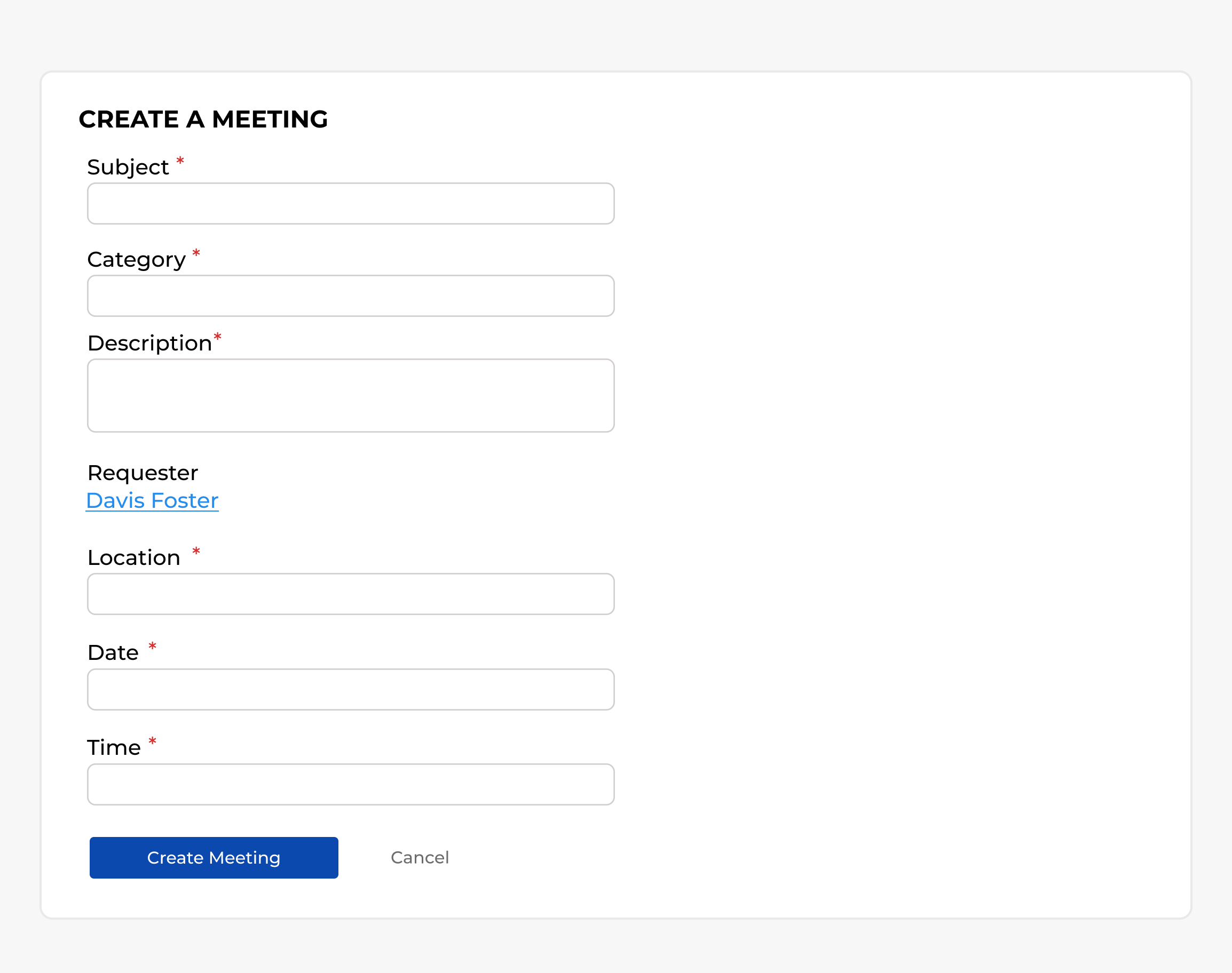
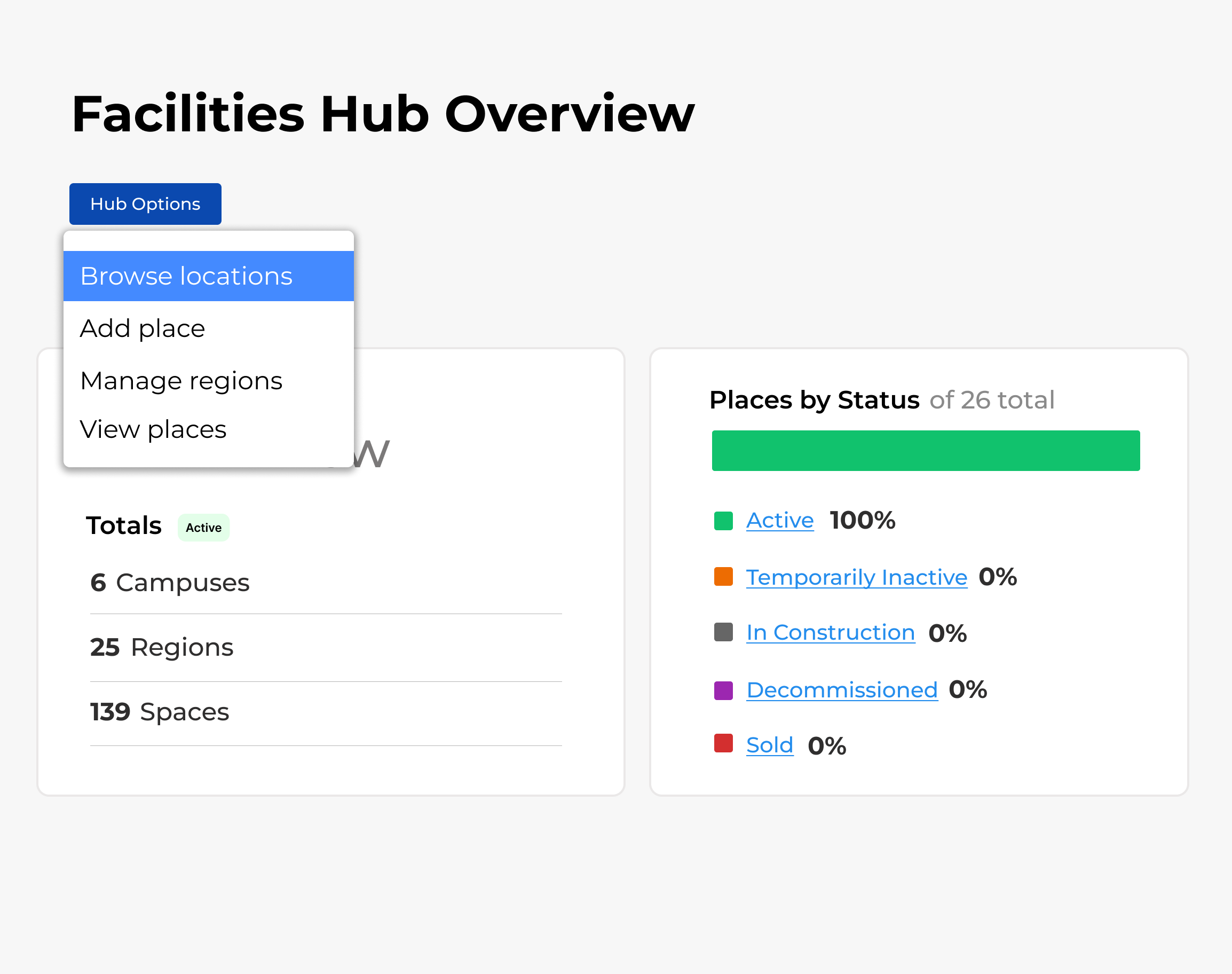
"A design system is only as good as its implementation. By building these components in code myself, I ensured that every layout—from simple meeting forms to complex data hubs—maintained strict accessibility standards without sacrificing visual flexibility."
Key Patterns Developed
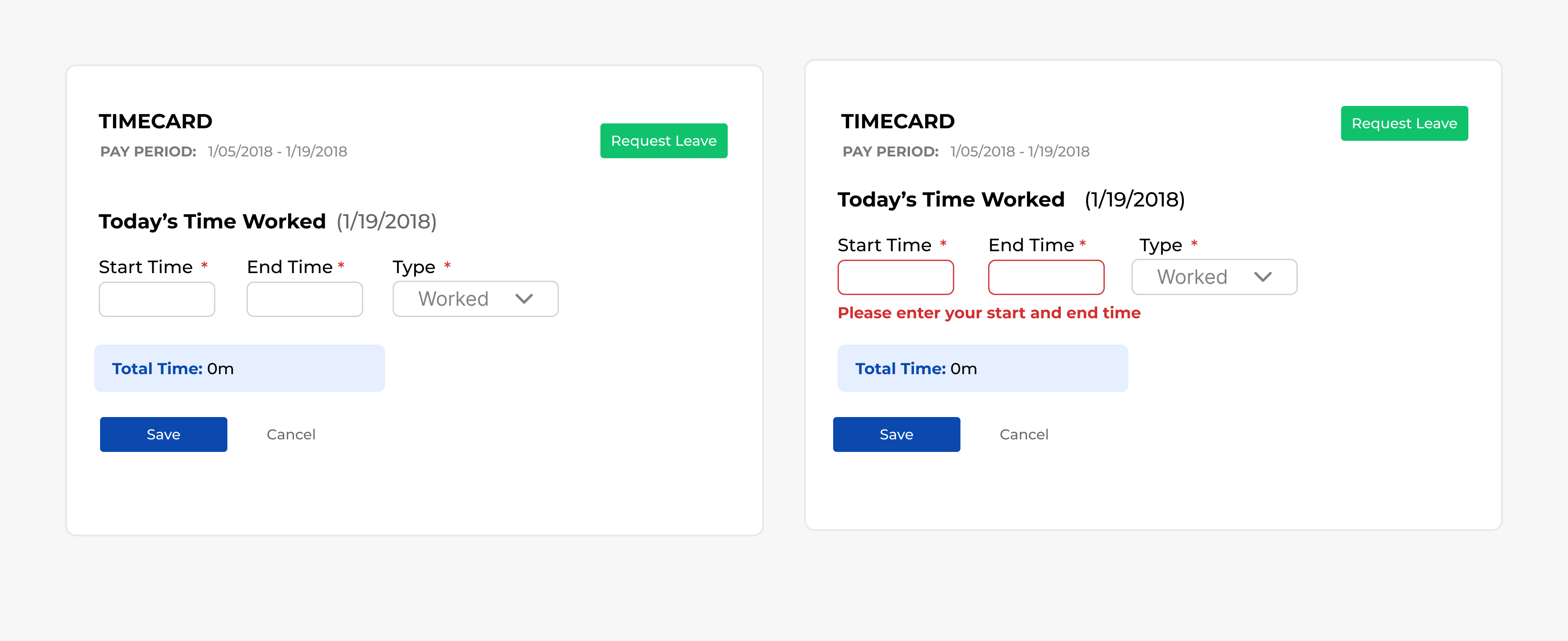
- Dynamic Form States: Built robust error and empty states for timecards and scheduling forms to ensure clear feedback for all users.
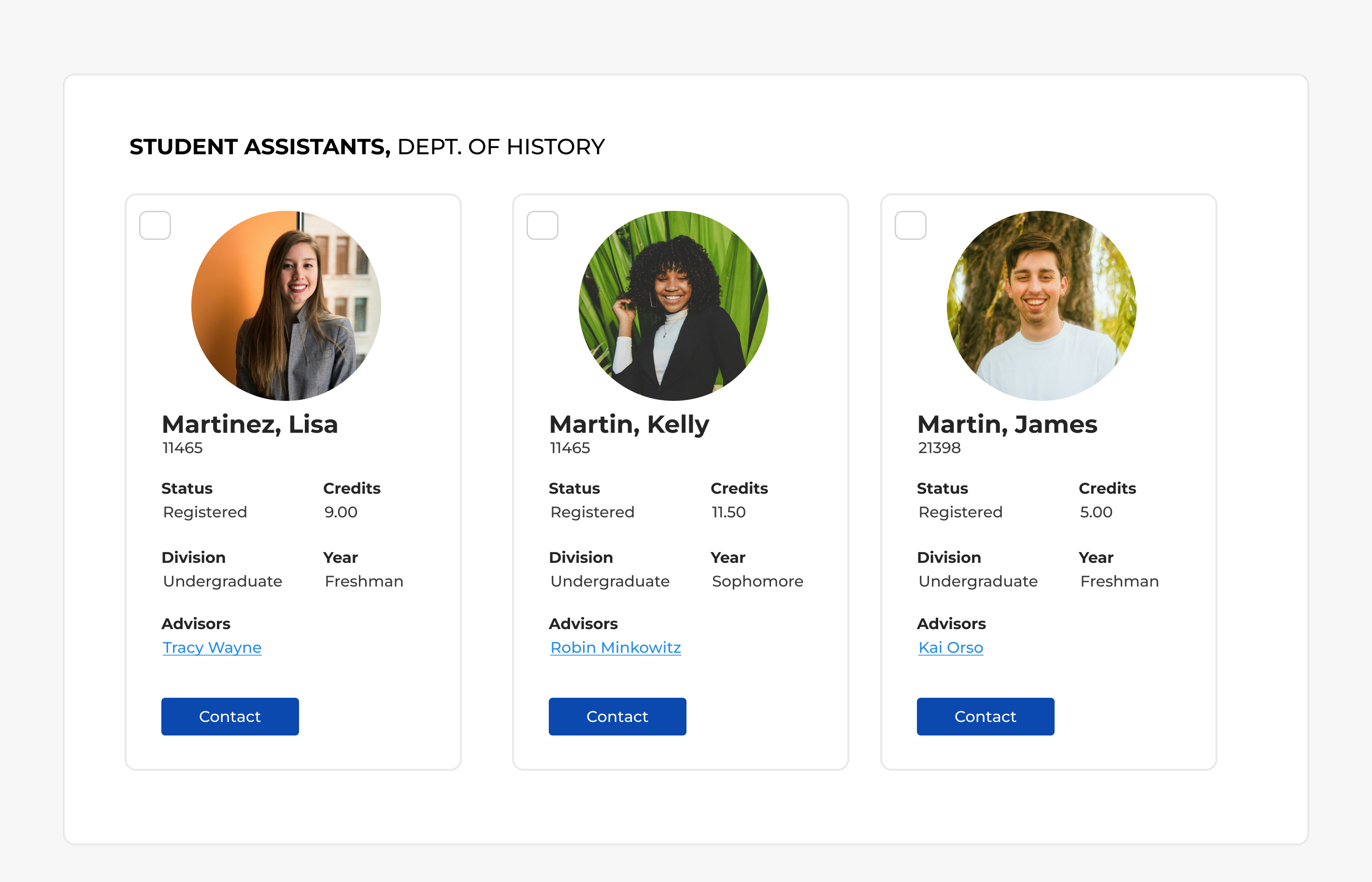
- Data Visualization: Created accessible card patterns for "Facilities Hubs" that translated complex status data into screen-reader-friendly structures.


