Project
004
Making Real-Time Data Accessible
Collaborating with UX teams to move beyond compliance toward a high-utility inclusive experience.
While working on the A11y Process I identified a critical gap in our delivery lifecycle: the absence of accessibility design annotations. When accessibility requirements aren't defined during the design phase, it creates three primary business risks
- Design Ambiguity: Without explicit intent, screen reader UX is left to engineering interpretation, leading to inconsistent user experiences.
- Engineering Friction: Developers are forced to spend cycles deciphering accessibility logic rather than focusing on feature implementation.
- QA Bottlenecks: The lack of documented accessibility acceptance criteria makes it impossible to perform objective, systematic quality audits.
To solve this, I partnered with the UX team to implement a standardized annotation system, starting with one of our most complex patterns: The Live-Calculation Interaction.
Info
Role
Accessibility Specialist, UX Designer
Tools
Figma
Overview
Problem
How can we ensure the same experience for screen reader users in this calculation pattern?
Outcome
Reduction in Engineering guesswork, a defined acceptance criteria, and improved consistency and efficiency across teams.
The work
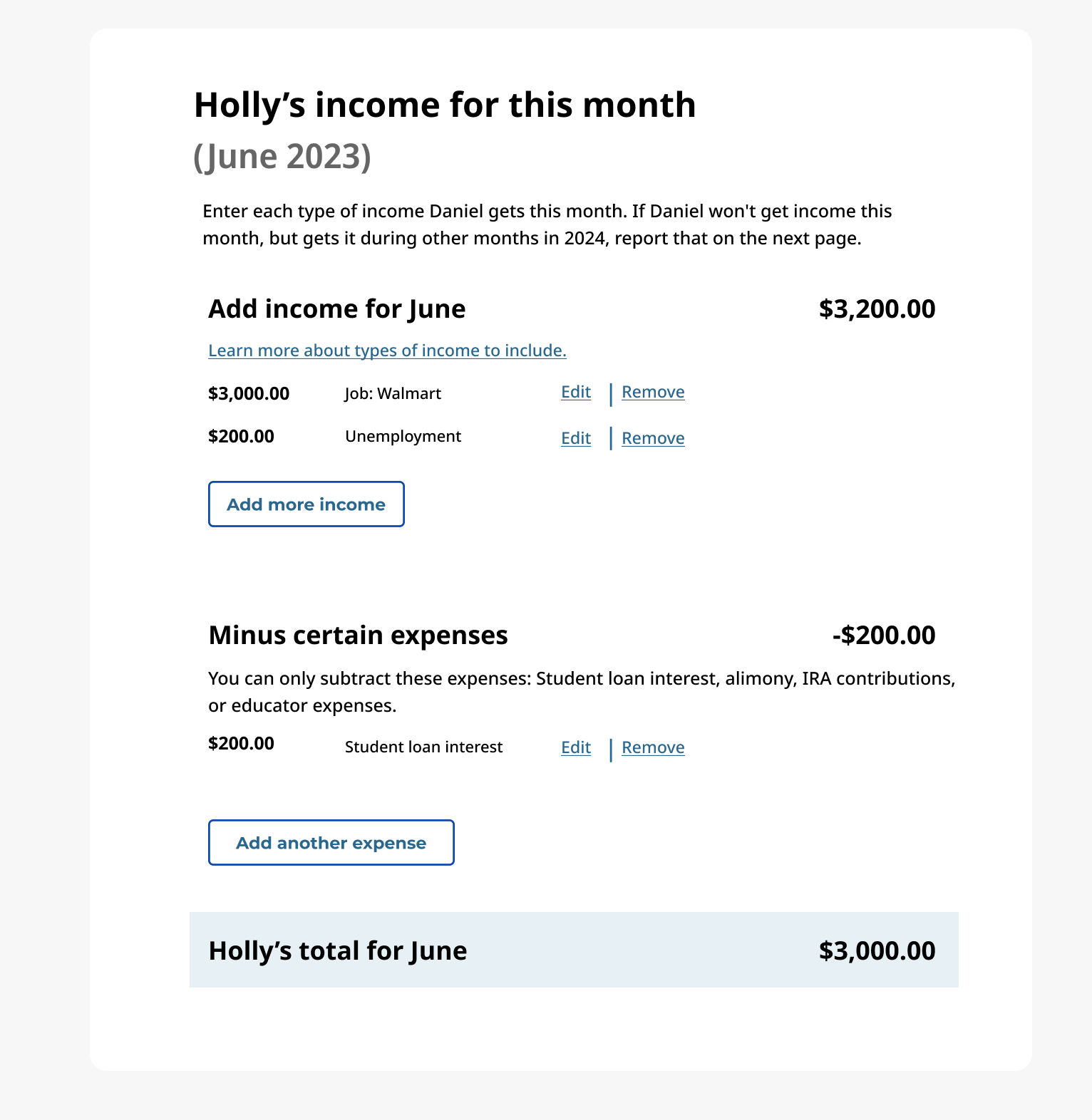
The purpose of this interaction pattern is for the user to enter income and expenses so that they can be notified if they may be eligible for financial assistance.
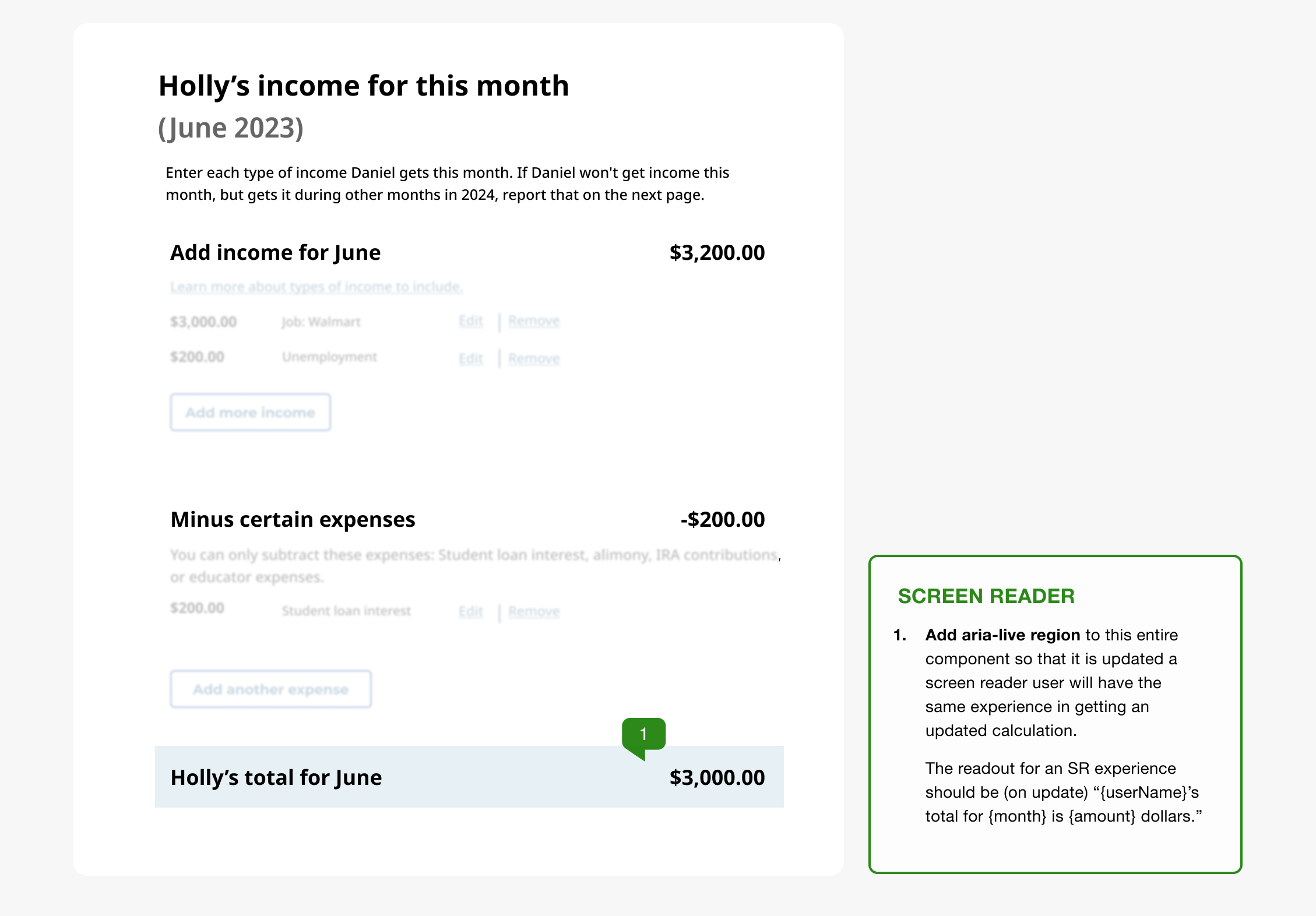
This component calculates a user’s income against their expenses in real-time. While visually intuitive, our testing revealed a critical accessibility barrier: the dynamic updates were not being announced to screen readers, leaving non-sighted users unaware of the calculation results unless they manually navigated the entire page.
This interaction was generally fine sighted users but screen reader users were not having the same experience — we knew they were not getting that calculated number announced to them unless they read the page line by line each time.
Solving ambiguity through documentation
Proactive Inclusion vs. Reactive Remediation Designing for accessibility is a strategic choice. By providing design annotations, we "shift accessibility left," eliminating engineering guesswork and ensuring that the inclusive experience is defined by the designer, not the developer.
This documentation provides three critical advantages:
- Clarity: Designers gain a deeper understanding of assistive technology flows.
- Efficiency: Engineers receive clear, actionable implementation requirements.
- Reliability: QA teams gain a source of truth for accessibility acceptance criteria.
Below are examples of typical annotations I require of designers.
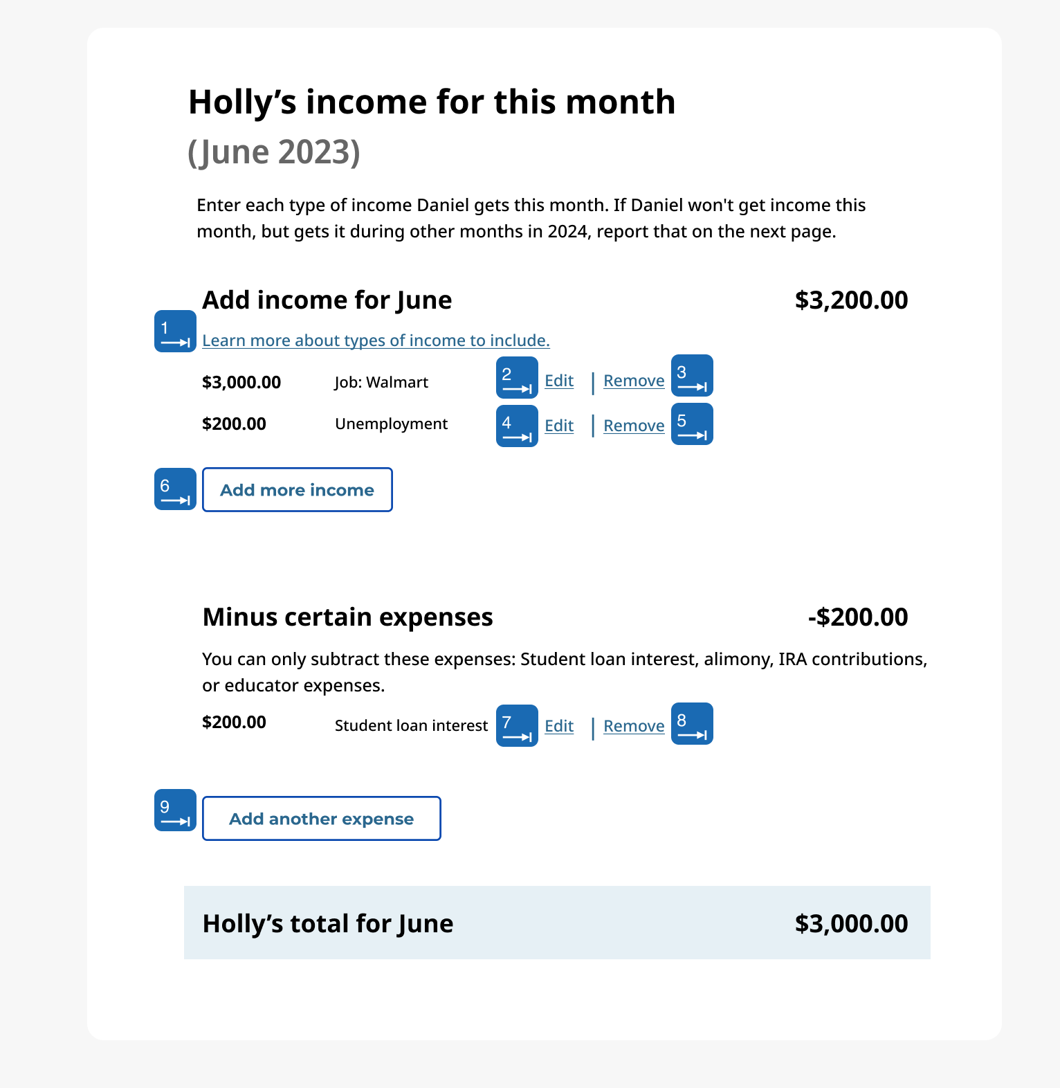
General focus order
The focus order of tab stops follows an expected flow in this pattern. This is useful to document for Engineers so we have acceptance criteria to test against and, again, it's helpful as an exercise of awareness for Designers.
Focus handling based on action
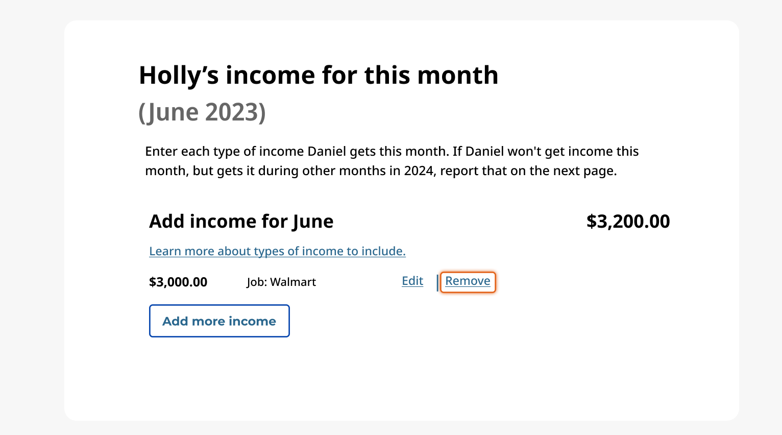
Managing State and Focus Logic Accessibility is about more than just reading text; it’s about managing the user's "place" in the experience. I collaborated with the UX team to define focus-management rules for dynamic state changes:
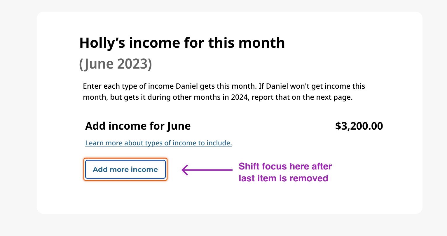
- Destructive Actions: When an item is removed, focus is programmatically shifted to the "Add more income" button to prevent "focus loss" (where the cursor resets to the top of the page).
- Logical Continuity: This ensures the user maintains their context and can continue the task without disorientation.
Screen reader annotations
Engineering for Real-Time Feedback In a live calculation, the core value is the immediate result. To ensure parity for non-sighted users, I developed and tested a coded prototype to determine the most effective communication pattern.
The Solution: I implemented an ARIA-live region on the component container. This ensures that as the total updates, the screen reader automatically announces: “{userName}'s total for {month} is {amount} dollars."
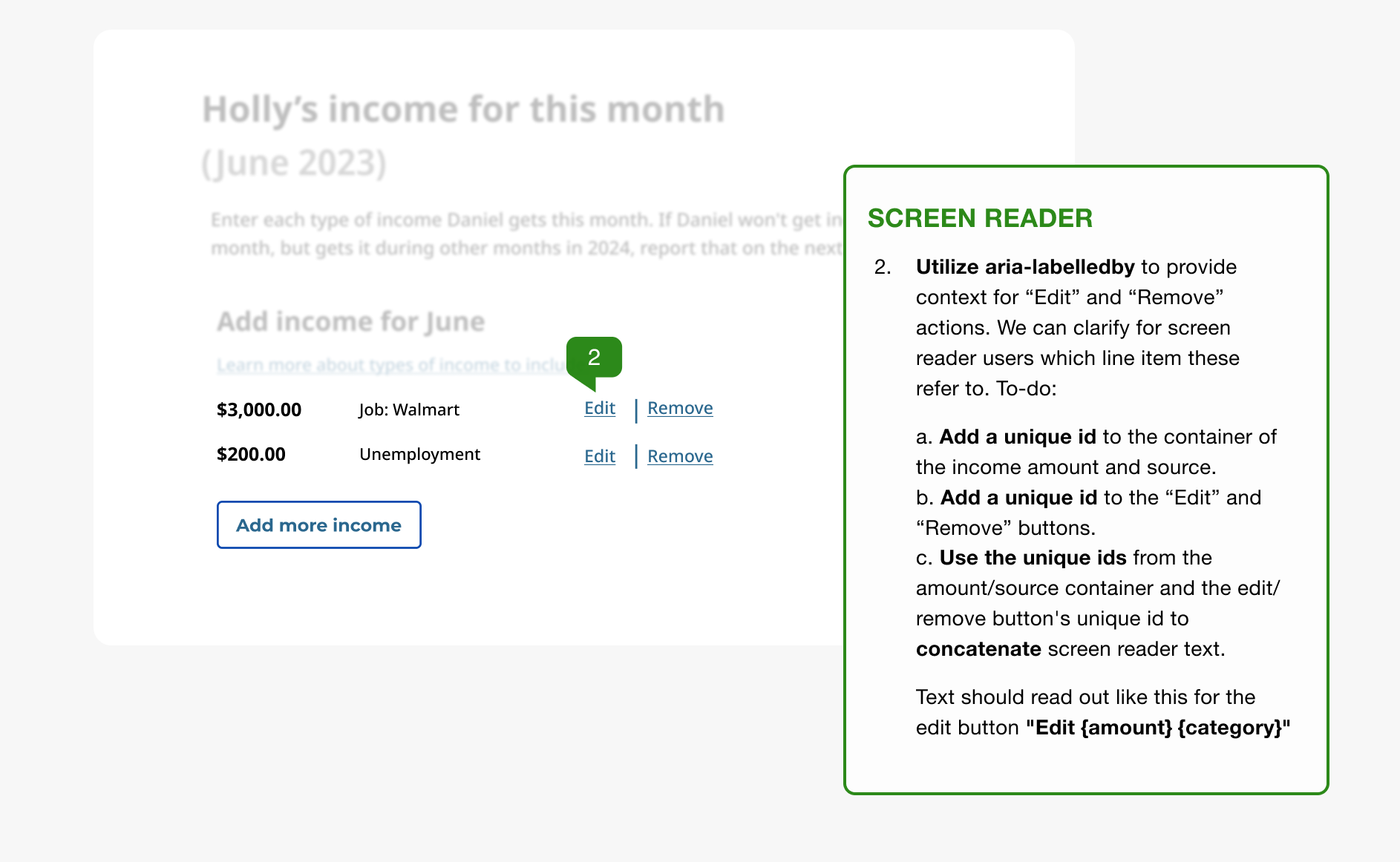
Refining Context with ARIA-Labelledby: To prevent ambiguity for "Edit" and "Remove" buttons, I provided guidance for utilizing aria-labelledby. By concatenating unique IDs from the income source and the action button, the screen reader provides full context: “Edit [Amount] [Category]” rather than a generic "Edit button."
Next, we need to provide context for the "Edit" and "Remove" buttons. Otherwise a screen reader user may think "Edit what?" or "Remove what?"
We can do this easily by utilizing the aria-labelledby attribute. My guidance to the Engineer was:
- Add a unique id to the container of the income amount and source.
- Add a unique id to the “Edit” and “Remove” buttons.
- Use the unique ids from the amount/source container and the edit/remove button's unique id to concatenate screen reader text.
Text should read out like this for the edit button "Edit {amount} {category}"
Outcome and impact
The implementation of this annotation system and interaction logic transformed our delivery process from a "wait and see" audit model to a proactive, inclusive design culture.
- Zero Critical Defects: The calculation component passed formal 508 testing with zero accessibility defects upon first release.
- Reduced Rework: By defining ARIA logic and focus management in Figma, we eliminated the 2–3 day feedback loop typically required for post-development remediation.
- Scalable Standards: The "Contextual Button" (aria-labelledby) and "Live Feedback" (aria-live) patterns were adopted into the broader Design System as the standard for all future interactive calculators.
In our research we most commonly heard:
""By documenting the 'unseen' experience, we ensured that the most critical part of the user journey—understanding financial eligibility—was truly available to everyone.""